
You've matched a sage linen on your phone, ordered three metres, and unrolled it beside the trim in daylight to find it reads grey olive. The dress you pictured was soft and fresh. The cloth in your hands looks moody, almost muddy, and you're now deciding whether to cut it, dye around it with different buttons, or admit defeat.
Green does this more than most colours because your eye reads its undertone as much as its depth. Add yellow and it warms toward olive. Add blue and it cools toward teal. Add grey and it dulls toward sage. A screen adds light, print sits flat, and fabric absorbs, reflects and wrinkles, so the same green moves again on cotton, viscose, Tencel or jersey.
The eight resources below are judged on one question. Does the green survive the move from screen or paper onto real cloth? Each one gives you a naming or matching system, but none replaces a physical swatch held next to skin, lining and trim.
Treat colour swatches green as a testing problem, not a shopping problem. Pick a reference, translate it into the exact fibre you'll sew, and only then buy yardage. That fabric first test is how I've ranked these tools.
1. Pantone Textile Color System (TCX)
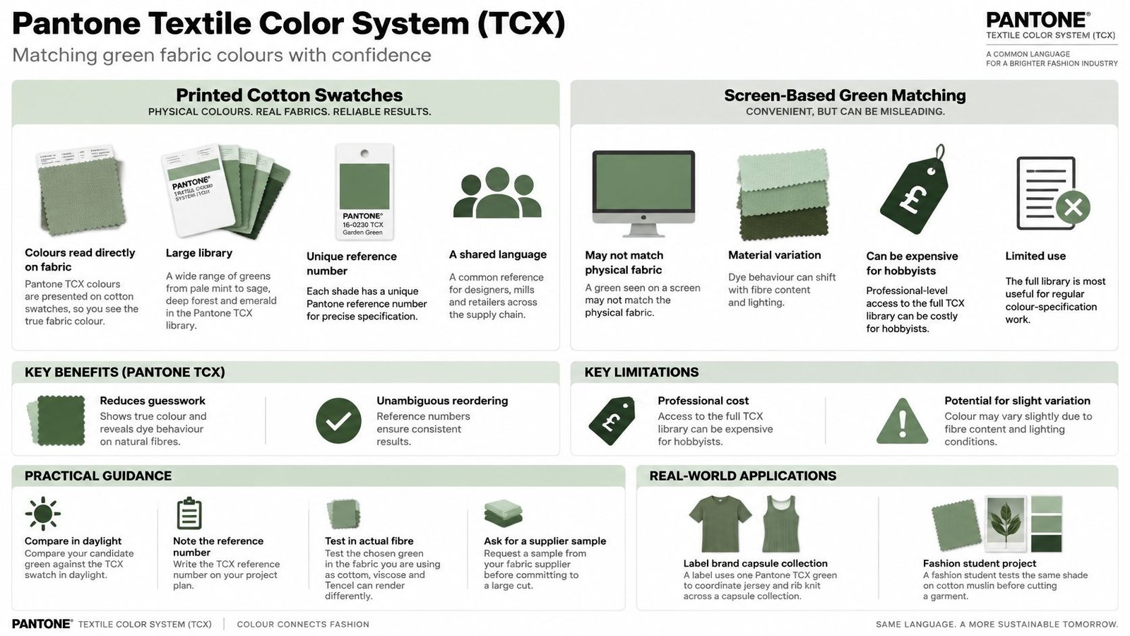
If you need the same green in a jersey bodice, a rib cuff and a woven skirt, start here. Pantone TCX puts each shade on a cotton swatch, not just on paper or a monitor, so you're comparing cloth to cloth from the beginning. That's why small brands use a TCX number when they brief two different suppliers.
Say a label builds a capsule around a deep bottle green. The designer pins the TCX cotton chip to the tech pack, then orders jersey, rib knit and lining against that number. A student can do the smaller version, testing the same reference on a cotton muslin before cutting viscose that will take dye differently and shine more.
Use a current example to train your eye. Pantone's London Fashion Week Spring/Summer 2026 report identifies PANTONE 16-6116 TCX Shale Green as a muted, earthy green with a dry, mineralised appearance. Lay shale beside olive and teal and you'll see it shift, bluer next to olive, warmer next to blue green.
How to use it on fabric
- Check in daylight: Hold your fabric sample flat against the TCX chip by a window, not under a warm kitchen bulb.
- Record the number: Write the full TCX reference on your pattern envelope so reorders don't rely on memory.
- Test the actual fibre: Cotton reads matte, viscose deepens, Tencel often looks smoother and cooler, jersey softens edges.
A TCX chip tells you what the target is. It doesn't promise your chosen base cloth can hit it.
For styling, a muted shale type green works as a near neutral. Try it in a Tencel shirt with charcoal trousers, cream knitwear or dark denim. Ask your supplier for a sample in the exact fabric before you commit, because finish changes everything.
2. Pantone FHI Color Guide (Fashion, Home + Interiors)
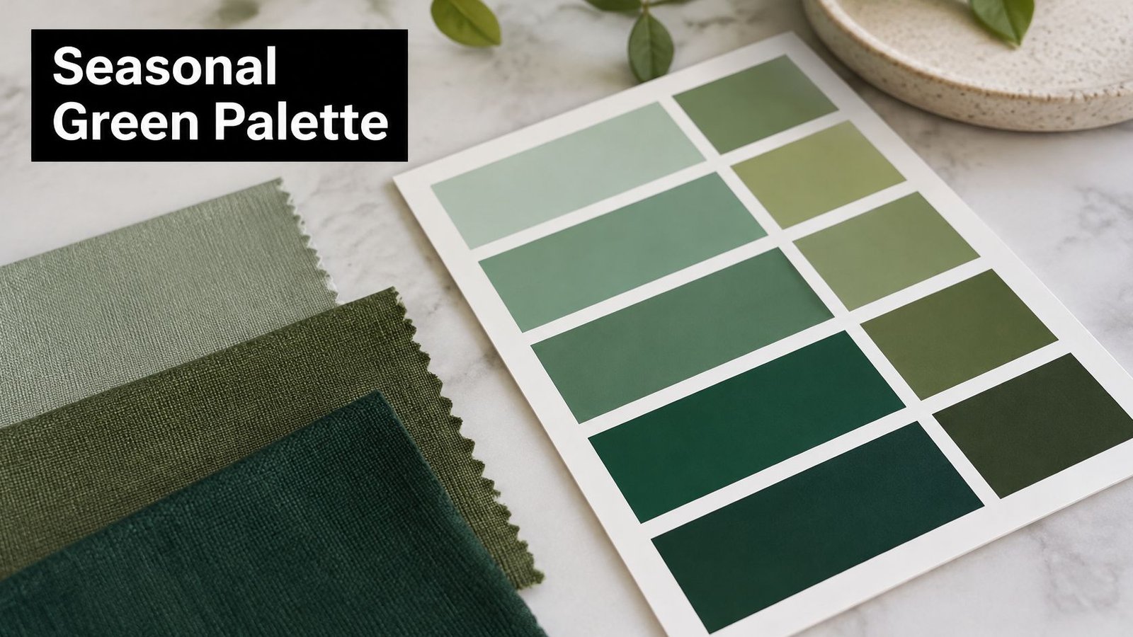
A green that looks balanced on a colour card can turn too bright on glossy viscose or dull on matte cotton. The Pantone FHI guide helps you choose a seasonal direction for clothing and interiors, with shades grouped into seasonal colour families in paper and digital formats. Use it to coordinate a dress, cushions and a tote, then check how the chosen green behaves on the actual fabric.
Trend shades need restraint. A strong yellow green may dominate a blouse, while a softer sage can sit comfortably alongside white and natural linen. For a shirt dress, wide trousers or a quilted jacket lining, use sage as the main colour and let the linen soften the combination.
Green paint sales have been rising in the UK. House Beautiful's report on Homebase sales data reported a 29% increase in 2024. For a fabric project, the broad trend is less useful than the specific green: sage, mint, olive, forest and lime create different effects and are not interchangeable.
Making a trend shade wearable
- Anchor with a neutral: Pair seasonal green with oatmeal, navy or stone for a combination that is easy to wear beyond one season.
- Adjust for skin and room: If the card feels too sharp, choose a warmer or cooler green rather than copying it exactly.
- Compare finishes: Set matte cotton beside glossy viscose in daylight. The colour family may match, but surface and fibre can change how light and depth read.
- Save references: Keep the FHI number with a fabric offcut so you can compare the reference against cloth for a repeat project.
Use FHI as a starting point, not a fabric match guarantee. It helps narrow your colour direction and build pairings; a swatch on the intended cloth shows whether the green works for the garment and how it sits beside other fabrics.
3. RAL Classic Color System
RAL wasn't made for dressmaking, and that's exactly why it helps with home sewing. This German standard gives greens four digit codes recognised across Europe in paint, industry and design. When your fabric has to sit beside something already made, a code beats a vague name like mint.
Take RAL 6029 Mint green. A sewist paints a cabinet in that shade, takes the fan deck to a fabric shop, and holds cotton canvas against it for a cushion cover. RAL 6018 Yellow green works the other way, letting a product designer specify a textile covered panel so suppliers in different countries aim at the same target.
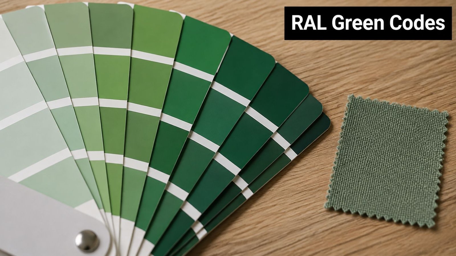
The drift is finish. Gloss paint throws light back and looks cleaner. Matte cotton, brushed canvas or corduroy absorbs light and reads darker and duller, even when the hue is close. A mint that sings on a painted chair frame can look flat in a heavy cushion fabric unless you add piping, texture or a paler partner cloth.
Where RAL earns its keep
- Write the code down: Put the RAL number on project notes for thread, zips, paint and trim.
- Bring the fan deck: Compare in the shop under daylight near the door, not only under spotlights.
- Match finish where you can: Satin viscose sits closer to eggshell paint than slubby linen does.
- Coordinate the hard parts: Use the code for buttons, webbing, bag hardware paint and upholstered frames.
Don't expect RAL to solve a skin tone question. It's a specifying tool for objects and interiors. For a cushion, apron, storage box cover or market stall banner that must match existing paintwork, it's the clearest shorthand you'll get. For a dress, translate the code into fabric and drape it on your shoulder first.
4. Munsell Color System
Words fail with green. One shop's olive is another shop's moss, and sage covers everything from grey green to soft yellow green. Munsell replaces that argument with three measurable parts, hue, value and chroma. Hue says where the colour sits, value says how light it is, and chroma says how strong it is.
Developed by American painter and professor Albert H. Munsell in the early 1900s, the system lets you write a shade like 5G 6/4 for a muted mid tone green. A textile student can send that notation to a print mill and have a real conversation. Did the sample come back too dark, or just too vivid? Munsell separates those problems.
A quilter's way in
Say you want a gradient from pale eucalyptus to deep woodland. Hold the hue steady, step down the value scale in even moves, and keep chroma similar so no strip jumps out as neon. You'll get a calm run for a quilt, a set of jersey tops in tonal greens, or colour blocked sleeves that belong together.
- Vary value only: Lighten or darken one hue for cohesive tonal sets.
- Use chroma deliberately: Lower it for natural, wearable greens. Raise it for sportswear, children's clothes or a sharp accent.
- Write briefs in notation: It travels better than poetic colour names.
- Proof on cloth: Screen values shift with calibration, and weave shifts them again.
Practical rule: If two greens clash, change only value or only chroma. Changing both at once hides what fixed it.
Munsell is the slowest tool here and the most precise for learning. You won't use it to impulse buy fabric. You'll use it when a green is nearly right and you need language for what's wrong, too grey, too dark or too loud for the garment you planned.
5. Adobe Color
Adobe Color is free, fast and dangerous in the best way. Its wheel and harmony rules, analogous, complementary and triadic, let you build a palette around a green in minutes. Better still, you can extract colours from a photo, which grounds the palette in something real.
Upload a forest walk photo and you'll pull out bark brown, leaf green, moss, pale sky and a muddy path tone. That becomes a quilt colourway with natural proportions. A small brand can do the same with a location photo, then hunt for the nearest cottons and linens on supplier swatch cards.
Watch the screen trap closely. Adobe gives you hex codes made of light. Cotton poplin will mute a vivid lime, viscose will deepen a teal green, and jersey will soften contrast because the knit surface breaks colour up. Order fabric swatches from More Sewing and pin them over a printed palette before you judge it.
Techniques that translate to sewing
- Analogous for calm: neighbouring yellow greens and blue greens suit dresses, scarves and bedding.
- Complementary with care: Red and pink partners make green pop, but use them as trim, lining or a small print flower.
- Extract from context: Photograph the room, coat or shoes the make must sit with.
- Share the hex codes: Collaborators can see the intent, then match to real thread and fabric.
Accessibility matters if you're publishing that palette or selling from it. The UK Government Design System colour guidance requires text and interactive elements to meet WCAG 2.2 AA contrast criteria. Name every swatch in text. Don't rely on green alone to show what's selected or in stock.
6. Coolors Palette Generator
Coolors is useful when a green needs possible partners, not a definitive fabric match. Press the spacebar to generate five colours, lock one, then cycle through alternatives. That quick process can help narrow forest, sage and olive choices before you compare them with cloth.
Start with a deep forest green for a knit dress, then generate cream for a collar, rust for buttons or topstitching, and soft blue for a lining. For table linens, lock sage and try cream and terracotta alongside it, then compare those colours with cotton fat quarters. The combinations are prompts, not fabric matches: a screen palette cannot show how cotton, viscose, Tencel or jersey will render the same green.
Coolors gives each colour equal visual weight, while a garment rarely divides colour so evenly. A palette that works as stripes may overwhelm a skirt when its brightest green covers most of the fabric. Decide which colour takes the largest area, which supports it, and which stays as a small detail, such as a zip tape, shoe or bag.
- Lock the anchor first: Start with the green you have already checked against your skin or the room.
- Limit the main colours: Try a main fabric, a neutral partner and one accent. Add more only if the project needs them.
- Print and shop with the palette: A paper print can dull colour, but it gives you a steadier reference than a phone at full brightness.
- Label saved palettes: Name each one for its project and season, and note the intended fabric type.
Check readability if a palette will appear in a digital lookbook or pattern listing. Pale mint behind white text can be difficult to read, so choose a darker text colour or a deeper green.
Use Coolors for first drafts. It can suggest pairings a shade card might not prompt, but it cannot show drape, sheen or how a green changes after washing. Compare the shortlist with fabric samples before deciding; the cloth, not the screen palette, determines whether the green works.
7. A Dictionary of Colour Combinations (Sanzo Wada)
Some palettes feel refined before you can explain why. Sanzo Wada's book, first published in Japan in 1933, is full of them. It pairs traditional Japanese colour names in thoughtful combinations, including moegi, a fresh young green that sits beautifully with warm grey, indigo and softened neutrals.
A textile student might take moegi with warm grey for a kimono inspired printed cotton wrap top. A quilter might borrow a green and indigo pairing for scraps, then discover the indigo makes a tired olive look richer instead of browner. These are combinations with restraint built in.
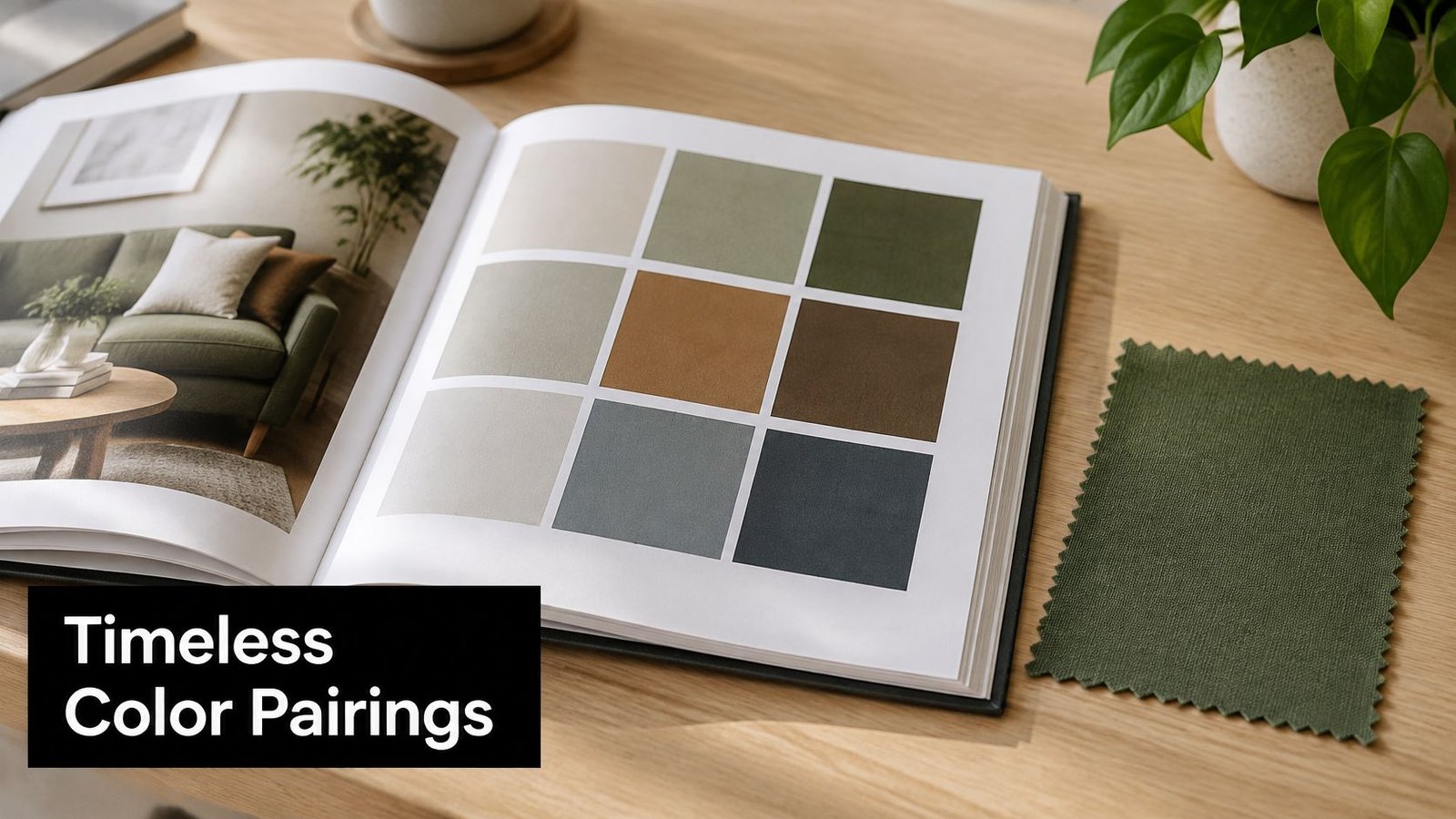
Print is also its limitation. Ink on paper can't show how a green collapses in a slubby linen, glows in a Tencel twill, or turns hard in a flat cotton. Treat each plate as a recipe for relationships, warm against cool, deep against pale, rather than a colour match to copy.
Getting sewing value from the book
- Name your palette: Borrow or adapt a name for your mood board, then staple in real offcuts.
- Study neighbours: Note what the green does beside indigo, charcoal, cream and rust.
- Build repeatable sets: Keep winning combinations for capsules, quilts and gift makes.
- Pair with physical swatches: The book plans, the cloth decides.
For bolder contemporary contrasts, compare its restraint with forest green campaign palettes from Sprello. Wada teaches balance. Modern palette tools teach impact. A green shirt dress with indigo denim and warm grey knitwear often needs the first lesson more.
8. Color Hunt
Color Hunt is where you go to see what other makers and designers are saving. Its community submitted palettes are voted on, tagged and easy to filter, with greens running from soft botanical sets to hard emerald and olive schemes. It feels current because it is built from current taste.
A beginner might pick sage, cream and dusty pink for tote bags, using sage canvas outside, cream cotton lining and dusty pink webbing. A designer might take olive and mustard into a printed cotton collection, where the mustard lifts olive out of workwear territory and into something warmer.
That popularity can mislead you. A palette earns votes as a small graphic, not as a wearable outfit in February light. Bright mint beside peach looks fresh on screen, then turns chilly in a cotton jersey top against winter skin. Emerald beside black looks dramatic, then reads almost black in a heavy fabric in a low light room.
Filtering for fabric, not likes
- Search green tags: Save widely, then delete anything you wouldn't wear near your face.
- Require light, mid and dark: That range gives you main fabric, lining and contrast options.
- Order real swatches: Test the palette in cotton, Tencel or jersey from More Sewing before cutting.
- Soften screen brights: Step a shade duller or deeper if the hex looks electric.
Label what you save in words, not colour alone. Kirklees Council's colour contrast guidance notes the Department for Education standard of at least 4.5:1 contrast for standard text and 3:1 for interactive controls, keyboard focus indicators and informative icons. Names, codes and outlines help every shopper, including anyone who can't reliably separate red from green.
Use Color Hunt as a trend radar and a shortcut to combinations. Then do the unglamorous part. Drape, wash and live with the swatch for a day.
How the Eight Green Colour Resources Compare for Fabric Projects
The best resource depends on whether you need a physical reference, a way to build a palette, or a system for describing colour. For fabric, each has a limit: a screen or paper sample cannot fully show how green will look on cotton, viscose, Tencel or jersey. Use the comparison to choose a starting point, then judge the colour on the fabric you plan to sew.
| Item | Best for | Cost | Fabric focus | Format |
|---|---|---|---|---|
| Pantone Textile Color System (TCX) | Precise fabric colour matching | Professional-level; can be expensive for hobbyists | High; cotton swatches | Physical swatch library |
| Pantone FHI Color Guide (Fashion, Home + Interiors) | Planning seasonal colour stories | Printed guides are relatively costly | Apparel and home textiles | Paper and digital guide |
| RAL Classic Color System | Coordinating colours across materials | Physical fan decks add cost | Limited; not textile-specific | Numbered system with fan decks and digital references |
| Munsell Color System | Learning colour theory and describing shades precisely | Chart or software may be needed to apply the notation | Limited; not linked directly to fabric products | Scientific notation with charts or software |
| Adobe Color | Creating coordinated digital palettes | Free online tool; an account is needed to save palettes | Limited; digital colours need fabric testing | Online palette tool |
| Coolors Palette Generator | Quickly brainstorming colour combinations | Basic use is free; some features are limited | Limited; digital palettes need fabric testing | Online palette generator |
| A Dictionary of Colour Combinations (Sanzo Wada) | Finding artistic, historically rooted colour pairings | Printed book purchase | Inspirational; not a fabric swatch library | Printed reference book |
| Color Hunt | Browsing community-created colour palettes | Free | Limited; digital colours need fabric testing | Community palette website |
TCX is the most direct choice here for matching fabric because it uses cotton swatches. FHI helps plan colour stories for apparel and interiors, but its printed guide is a reference, not cloth. RAL and Munsell offer ways to coordinate or describe shades; neither is tied directly to fabric products, so confirm the result on your chosen material.
Adobe Color and Coolors make palette building quick, while Color Hunt offers community-created combinations. Their screen colours are starting points, not reliable previews of finished cloth. Wada's book is useful for pairing inspiration, but it is not a swatch library. Pair shortlisted greens with the fabrics and garment styles you have in mind, then check how the material changes their appearance.
From Shortlist to Cut: Choosing and Testing Your Green
Start with two or three greens, not ten. One might come from a TCX chip, one from a Coolors roll, one from a Wada plate. Write each down in every form you have, hex code, RGB value, RAL code or Munsell notation, plus the plain name you'll use in a shop. Names alone drift. A record lets you reorder, match thread and explain a mismatch to a supplier.
Green deserves that rigour in the UK because it's not an abstract trend colour for many people. The UK Government access to green and blue space statistics for England found 80% of households met the 15 minute commitment for green or blue space. You see park, garden, woodland and allotment greens constantly, so your eye notices quickly when a fabric green is too artificial, too grey or too blue for the job.
Test each shortlisted green on the exact base you plan to sew. Cotton will usually read matte and honest. Viscose deepens and moves, which flatters emerald in a blouse but can make sage look darker in folds. Tencel often gives a smooth, slightly cooler surface for trousers and shirts. Jersey breaks colour across loops and stretch, so pull it gently and check it again. A green that only works unstretched on a flat card will let you down in a fitted top.
A daylight test that catches most mistakes
- Use three lights: Check by a north facing window if you can, again in warm evening light, and once under your sewing lamp.
- Add neighbours: Lay the swatch beside white, cream, navy, denim and the lining or trousers it'll be worn with.
- Test care: Wash, press and rub a damp white cloth over a corner to check colour shift, shrinkage and transfer.
- Judge opacity: Hold pale greens over skin and over print. Mint and pale sage often need lining in dresses and tops.
Popular does not mean wearable. A deep green can photograph beautifully and still sit almost black on a heavy cloth in a dim hallway.
Think about lifespan while the swatch is still cheap. The greenest looking fabric isn't automatically the most responsible choice. A durable deadstock green already in circulation may outlast a fashionable delicate cloth that fades, pills or needs replacing. Test for pilling with your thumbnail, crease recovery in your fist, and whether the colour survives the wash temperature you'll realistically use.
Then build the final palette with restraint. Pair your chosen green with one neutral and one accent, and compare fabric undertones before choosing the accent in the same light as the main cloth. Cream softens sage for a summer dress. Navy sharpens forest in a jacket. Mustard warms olive in a quilt. Dusty pink can lift a greyed green, but only if the undertones don't fight.
Order fabric sample swatches before you cut yardage, every time the colour matters. Colours in product photos and on screens vary with device settings, and monitor settings vary enough to move a sage into olive. If a colour question remains unresolved, contact us at More Sewing before purchasing and describe the project, fibre and partner fabrics. A two minute question is cheaper than three metres of the wrong green.
Order your green fabric sample swatches first, test them in daylight against your lining, trim and skin, and only then commit to the cut. You'll find cottons, viscose, Tencel blends, jerseys and deadstock options to compare at More Sewing, so you can choose the shade that still looks right on cloth, not just on screen.
