
Dressmaking, Fabric
Seersucker and Chambray Pattern Matching Guide
You've got both fabrics spread out on the cutting table, scissors ready, and the stripes look clean at first glance. Then the seersucker starts to ripple under your hand, the chambray looks calmer than expected, and the neat little plan you had for perfect stripe matching begins to wobble. That's usually the moment a good sewing decision starts, because these two cloths ask for different handling, and forcing them into the same matching logic wastes time, fabric, and patience.
Why Seersucker and Chambray Need Different Matching Approaches
A lot of sewists treat seersucker and chambray as if they ask for the same pattern-matching treatment. They do not. Seersucker has a built-in puckered structure, while chambray gives you a much quieter shift through yarn colour, so the first can look wrong just because you have moved it, and the second can look almost unchanged even when the seam is perfectly straight.
That difference matters before the first pin goes in. Seersucker's stripes are part of the weave itself, and British textile history places the cloth's name in trade and language by the mid-18th century, with earlier references tied to the East Indies and Persian shïr o shakkar meaning “milk and sugar” in one historical account (Our State on the story of seersucker). Chambray, by contrast, belongs to the plain-weave family, with its identity coming from coloured warp and lighter weft yarns rather than a dramatic repeated motif.
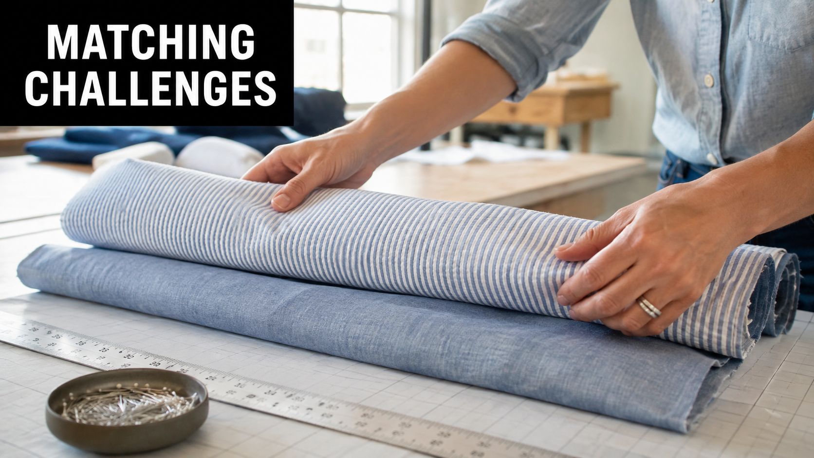
Read the cloth before you reach for the ruler
The easiest mistake is to assume every stripe deserves perfect alignment. With seersucker, the puckering itself creates movement, so a ruler-only approach can trick you into chasing lines that shift the moment the fabric relaxes. I've found that the more carefully I handle a seersucker panel, the more I need to ask whether the repeat is steering the garment, or just creating visual rhythm.
Chambray behaves differently. Because it is usually a smoother plain weave, the eye reads its colour variation as texture, not as a hard pattern to line up. That makes it far more forgiving on seams where a tiny offset will vanish once the piece is worn. If you want a contrast point for a more decorative pairing, you can browse Memphis scarf styles, then judge whether the cloth in front of you needs that level of precision at all.
Practical rule: if you cannot tell whether the fabric has a repeat from across the table, treat it as a texture first and a pattern second.
That is why the first decision is not “how do I match this?”, but whether the cloth even needs aggressive matching. If it does, commit to the layout carefully. If it does not, let the fabric do what it already does well.
Understanding the Weave Structures Behind Each Fabric
Seersucker and chambray may sit in the same summer stack, but their construction calls for different decisions at the cutting table. Seersucker is a thin, puckered cotton fabric, usually striped or chequered, and it is used for hot-weather clothing; one technique note says true seersucker can be created by a slack-tension method using two warp beams, with the stripes running in the warp direction (Wikipedia on seersucker). That puckering is part of the cloth itself, not a finish added later.
That built-in texture is what makes seersucker tricky to judge flat on the table. A stripe can look as if it should match perfectly, then shift slightly once the fabric is relaxed, handled, or eased into shape. The more puckered the cloth, the less useful a ruler-only approach becomes.
Chambray is quieter, but it still has a structure worth reading before you cut. It is a plain-weave cloth made with lengthwise and crosswise yarns of different colours, and in common descriptions the filling threads are often white (fabric glossary reference). That gives it the soft denim-adjacent look many home dressmakers like, without denim's twill structure. The eye often reads it as tonal texture rather than a sharp repeat.
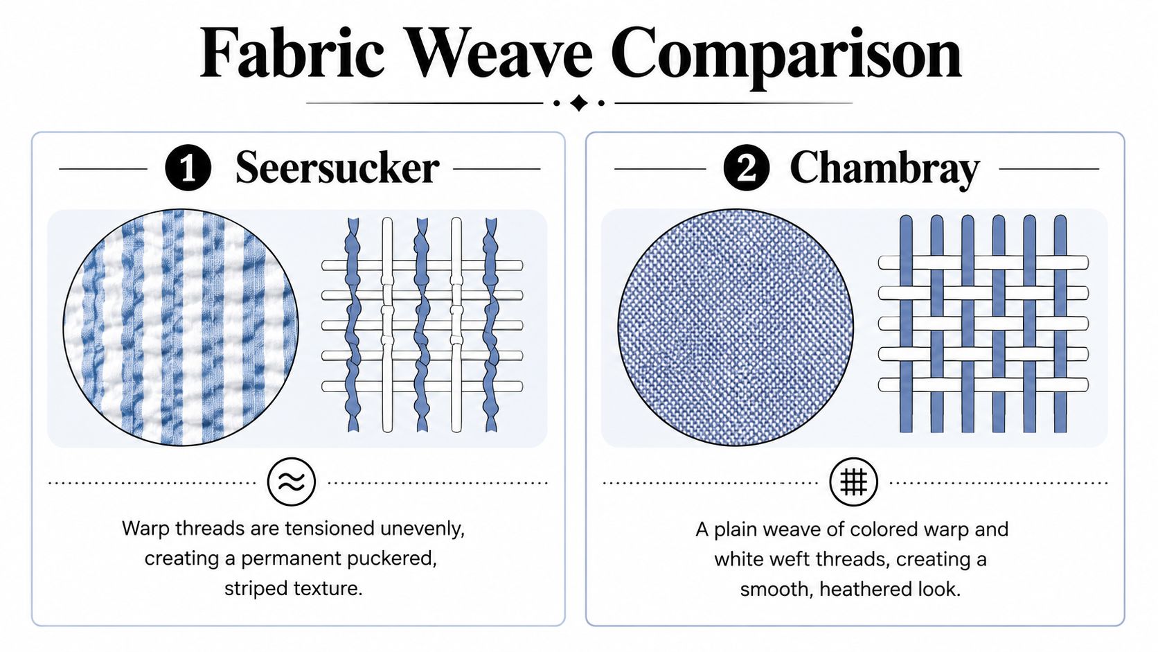
The practical difference is simple. Seersucker asks you to protect the puckered geometry, while chambray asks you to respect the colour balance of the weave. That is why both fabrics can behave more like texture than print, even when they carry a clear stripe or yarn effect. I plan seams differently for each one because the cloth tells me what sort of matching it can hold.
That is also why I do not force a perfect match just because a stripe is present. Some woven surfaces are best handled with a light touch, especially once the pattern is subtle and the repeat is only obvious close up. If the cloth reads cleanly from across the cutting table, it may already have enough visual order without exact alignment. In that case, let the texture do the work instead of chasing a match that will be hard to keep through sewing.
You see the same principle in scarves and other accessories, where woven surface and rhythm matter more than exact mirroring. A useful visual example is this browse Memphis scarf styles, because it shows how a woven design can read as pattern without needing every edge to lock together.
What this means at the cutting table
Seersucker needs careful handling because the repeat can shift while you work. I lay it out with a calm hand, keep the layers true, and check whether the stripe relationship still makes sense before I commit to a seam. If the puckering starts fighting the line, I stop trying to make it behave like a flat print.
Chambray is more forgiving, but only if you read it for what it is. A small seam offset usually disappears once the garment is worn, unless the design has strong topstitching or a very obvious yarn contrast. For that reason, I judge chambray by the overall surface first, then decide whether the seam line is worth fussing over.
The best test is plain. Hold the fabric at arm's length, then check it again under the presser foot. If your eye goes straight to the stripe, match it carefully. If your eye settles on the cloth as a whole, stop forcing alignment and cut for the texture you already have.
How to Lay Out and Pin for Accurate Pattern Matching
When the fabric really does have a visible repeat, the safest method is the sew-at-the-machine approach. Fold one selvage edge until the repeat aligns, hold it with low-tack tape, and stitch exactly on the crease of the fold. That method works because it keeps the matched line stable while you move the fabric under the needle, instead of trusting pins alone to stop drift.
For seersucker, layout matters even more. Cotton Incorporated's process-control guidance says the seersucker stripe should be 1.5 to 2.0 times the density of the ground weave when both use the same weave structure, and the seersucker yarn contraction should be about 2.5 times the ground yarn contraction (Cotton Incorporated PDF). That is why I always lay out the full repeat before I touch the shears. If you don't see the whole stripe relationship, you can't judge where a seam should land.
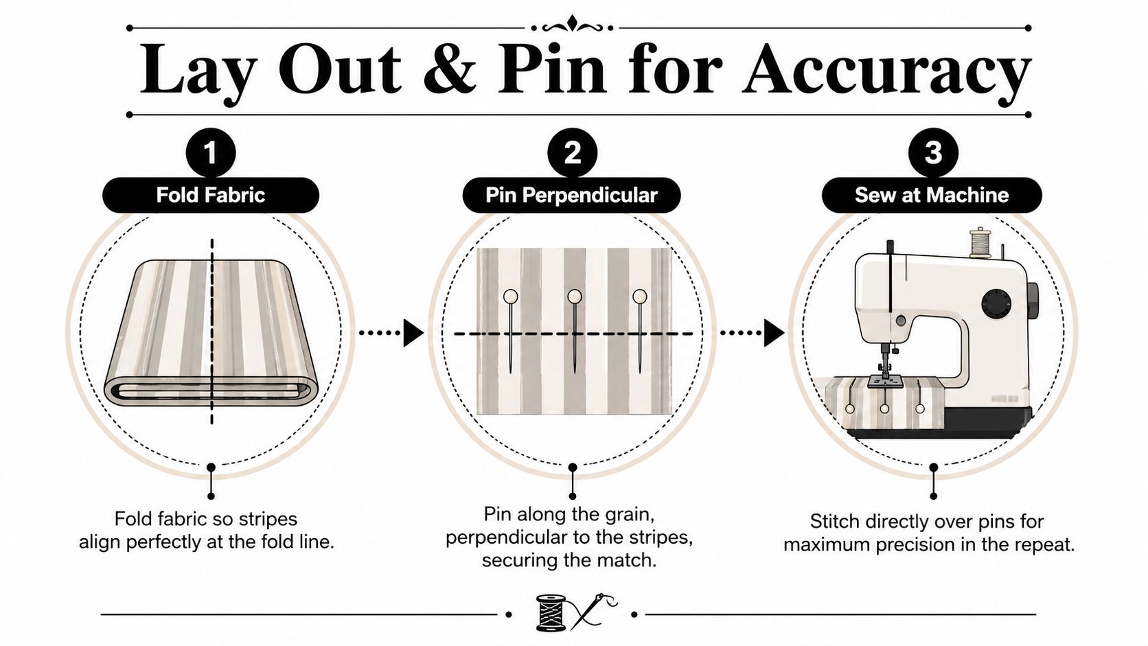
The biggest pitfall is seam slippage. Even careful pinning can drift once the foot starts feeding fabric, so I crease the seam allowance first, then tape the fold, then stitch on that line. Tape gives you a flatter, more reliable edge than a forest of pins, especially on a puckered cloth that wants to shift out from under the needle (Workroom Tech on pattern matching).
Small table, big difference
| Fabric choice | Matching priority | Best tactic |
|---|---|---|
| Seersucker | High if stripes are bold | Full repeat layout, tape the fold, sew at the machine |
| Chambray | Often low unless the weave is obvious | Check colour balance, then match only the seams that show |
Here's where the presser foot can ruin good work. Don't flatten the puckers with heavy pressing before cutting, because you'll make the fabric lie about its own shape. Handle it enough to align the repeat, but not so much that you iron out the surface character you bought it for.
Stitch the fold, not the fear. If the line wobbles while you're pinning, the machine line is where control comes back.
When to Stop Matching and Let the Texture Speak
This is the bit most tutorials glide past. On seersucker, perfect alignment can make the garment look busier, not smarter. The puckering is the point of the fabric, and if every seam, sleeve head, and bodice edge is forced into a rigid stripe conversation, the result can start to feel overworked, even a bit pyjama-like.
Striped seersucker tends to look best when it's given space, especially with plain companions and calm seam placement. A striped bodice matched to a striped sleeve can make the eye do too much work, while a cleaner seam line lets the texture stay the star. Existing style guidance already warns that similar-scale stripes can feel overwhelming, and that advice is useful because the garment can end up reading as stripe-on-stripe rather than cloth and shape (fabric pairing discussion).
Where I deliberately relax the match
- Side seams on a seersucker dress: I'll match if the stripe is bold and the seam sits front and centre, but I won't chase an invisible perfection around the side if it means distorting the panel.
- Sleeve heads and cuffs: I'd rather preserve the drape and let the sleeve fall naturally than force the stripe line into a false level at the crown.
- Chambray yokes and facings: if the fabric has a subtle tonal slub rather than a clear repeat, exact matching usually buys very little and eats time.
Chambray often gives you permission to be practical. A lot of the labour people spend trying to “match” chambray is wasted because the visual repeat may be so soft that the seam vanishes into the cloth anyway. A sensible check is whether the seam is meant to be seen from two metres away or only from the ironing board.
Useful question: does this seam need to disappear, or just behave?
That's the difference between careful sewing and compulsive sewing. Careful sewing respects the cloth, while compulsive sewing spends hours on a result the eye won't reward.
Choosing Complementary Scales and Colours for Pairing
A clean pairing starts before the cloth is cut. Lay the seersucker and chambray side by side, then ask which fabric needs to lead and which one should stay quiet. If both have a strong stripe or a lively check, the combination can feel busy very quickly. A finer seersucker stripe usually settles well beside a plain chambray body, while a bolder check needs space and a calmer partner.
Chambray gives you more choices than people sometimes expect. Depending on the weight, it can carry the structure of a shirt or dress, or sit back as a trim, yoke, or facing. That makes it useful for deciding where the eye should land. If the seersucker is the main feature, keep chambray on the parts that frame it. If the chambray is the larger field, let the seersucker work in smaller, clearer areas.
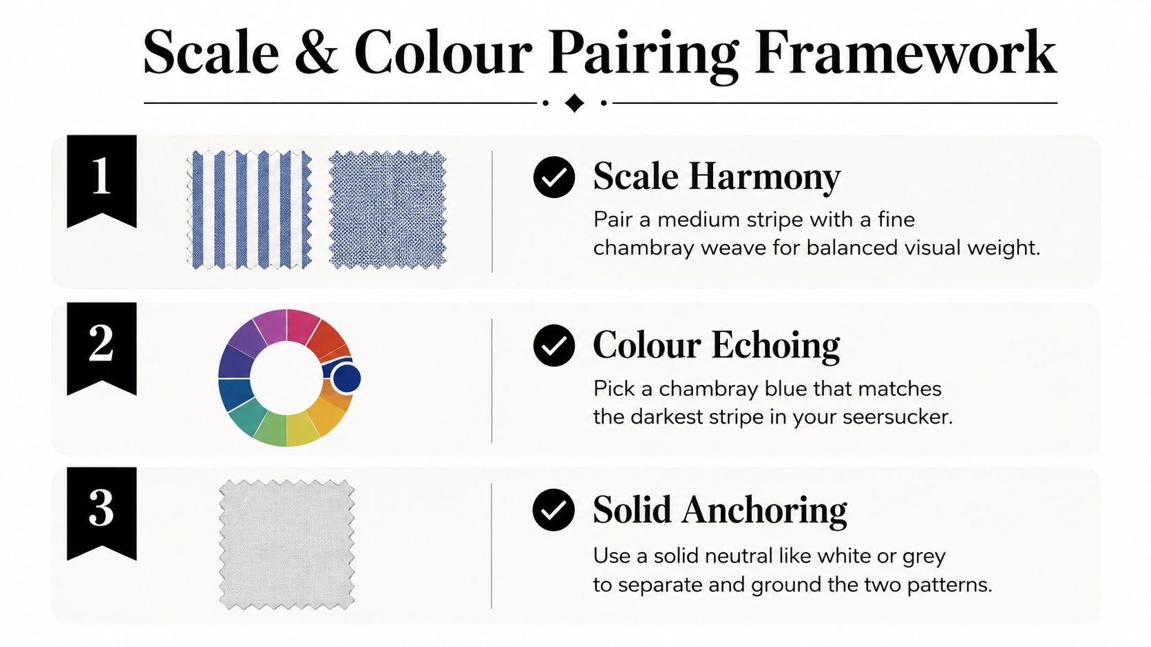
Colour matters just as much as scale, and I check it in daylight rather than under workshop lighting. A chambray blue that repeats the darkest line in the seersucker usually gives enough connection without flattening the contrast. If both fabrics feel equally assertive, I separate them with a solid neutral so the garment has one clear point of rest. That saves more projects than any perfect stripe alignment ever will.
The same idea helps beyond clothing. Makers choosing coordinated home fabrics often find that rhythm matters more than identical motifs, which is why patterned blankets for personalized gifts can be a handy reminder that harmony comes from balance, not exact repetition.
A working pairing framework
- Scale harmony: pair a medium stripe with a finer chambray surface so one fabric leads and the other supports.
- Colour echoing: choose a chambray tone that repeats the darkest stripe rather than the brightest one.
- Solid anchoring: use white, ivory, or a soft grey to separate the two fabrics when the contrast feels too lively.
The best pairs do not look identical, they look considered. If the swatches sit together without competing, and the eye can move across them without stopping at every seam, the pairing is doing its job.
Three Real-World Projects to Try With These Fabrics
A relaxed summer shirt is the easiest place to start. Use chambray for the body, then bring in seersucker for the collar stand and cuff facings so the contrast shows only where the eye naturally pauses. Flat-felled seams suit this project well because they're durable and tidy, and a size 80 universal or microtex needle usually handles light to mid-weight woven cottons cleanly.
Project notes that actually help
- Summer shirt: keep the seam allowance consistent, press seams open only where the construction allows it, and avoid over-pressing the seersucker collar pieces so the texture stays alive.
- Tiered midi skirt: make the yoke in chambray and the tiers in seersucker. The gathering at each tier seam hides small stripe offsets, so this is one of the few places where a near-match often looks intentional.
- Structured tote bag: use heavyweight chambray outside and seersucker for the lining. A heavier outer gives shape, while the lining adds a soft visual lift without demanding exact seam matching.
The tiered skirt is the easiest “don't force it” project of the three. Because the fabric is gathered, the stripe rhythm breaks up naturally, and that means you can save your matching energy for the yoke and side seams where the eye lands. I'd still cut the visible edges carefully, but I wouldn't obsess over a seam hidden in gathered fullness.
For the tote, the trade-off is durability versus texture. A firm chambray outer can take interfacing and topstitching better than a puckered surface, while seersucker inside keeps the project playful. Use a slightly stronger thread if your topstitching needs to read clearly, but keep the needle appropriate to the cloth so you don't punch unnecessary holes.
Best use of seersucker: where movement matters more than precision.
That's the thread running through all three projects. Put seersucker where the garment can breathe, and reserve exact matching for the places the eye will inspect.
More Sewing is a useful place to source quality cottons, deadstock, and haberdashery when you want a project to start with good cloth instead of compromise. If you're planning seersucker or chambray for your next make, visit More Sewing and choose fabrics that will behave well at the cutting table, not just look good on the roll.
