You're probably in one of two places right now. You've got a lovely print in your hand and you're wondering which solid will make it sing, or you've filled an online basket and you're hesitating because colours that looked perfect on screen can turn odd the moment they land on your cutting table.
That hesitation is sensible. Fabric colour matching isn't just about picking shades you like. It's about how colour behaves on real cloth, under real light, with texture, sheen, drape, and the rest of your wardrobe in the mix. A mustard linen and a mustard viscose don't necessarily read as the same mustard once they're made up.
The good news is that this is learnable. It isn't a mysterious gift some sewists have and others don't. It's a process. Once you know what to look for, you stop guessing and start making decisions that hold up at the cutting stage, at the ironing board, and when you finally put the garment on.
From Fabric Store Hope to Home Sewing Confidence
Most sewists know the feeling of being full of confidence in the shop, then doubtful at home. On the bolt, two fabrics can seem friendly enough. Once they're laid together on a table, one suddenly looks too cold, too flat, or far too loud.
That's because fabric colour matching happens in layers. Colour matters, yes, but so do undertone, value, texture, print scale, and finish. A brushed cotton softens a colour. A crisp poplin sharpens it. A slubby linen can make a dye look earthier than the same shade on a smooth sateen.
The mistake I see most often is treating fabric matching like paint matching. Fabric doesn't behave like a flat swatch from a decorating chart. It folds, catches light, throws shadow, and moves next to skin. That changes everything.
What confidence looks like in practice
Confident matching isn't about making every project subtle. Bold combinations can work beautifully. The difference is that they look deliberate rather than accidental.
A solid process usually includes:
- Choosing a lead fabric first so the rest of the palette has a clear reference point.
- Checking colours in person whenever possible because screens smooth out the quirks that matter.
- Comparing fabrics under more than one light source rather than trusting a single glance.
- Watching surface finish closely because matte and sheen can pull the same dye in different directions.
Practical rule: If you're still unsure after looking twice, don't cut. Pin, step back, and check again tomorrow.
That little pause saves a surprising number of disappointing projects. Colour decisions made in a rush are the ones people regret most. The best garments usually come from calm, slightly fussy choices at the beginning.
Colour Theory That Actually Helps Sewists
You don't need an art-school lecture to get better at fabric colour matching. For sewing, only a few ideas do most of the heavy lifting. Once you understand them, choosing pairings gets much easier.
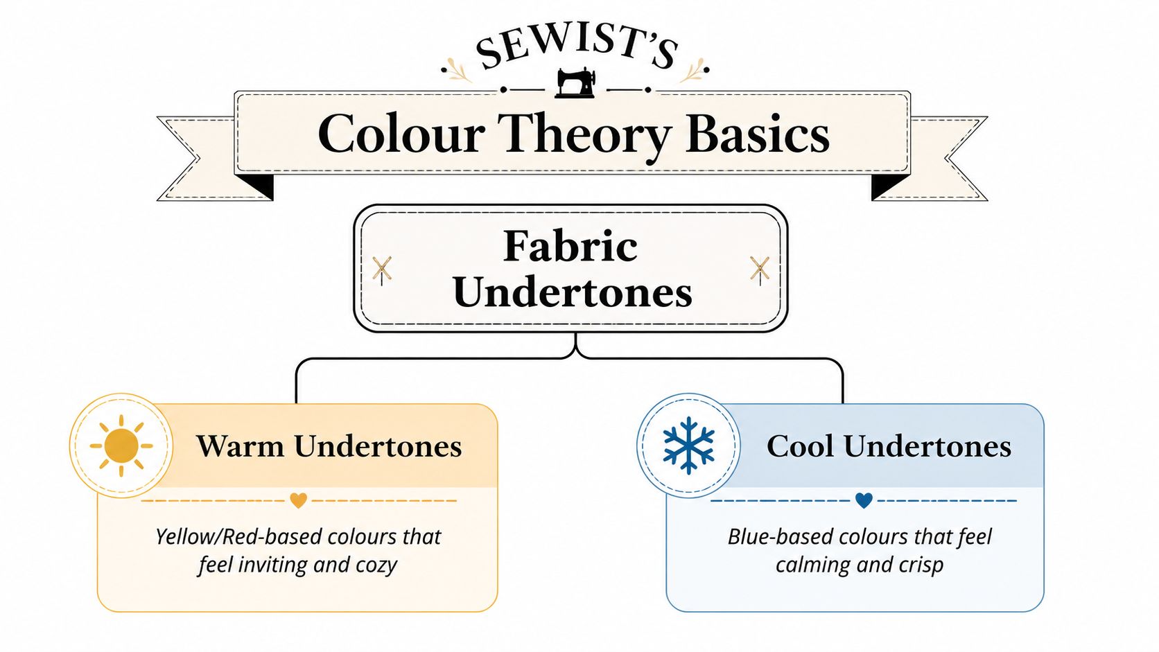
Undertone matters more than people expect
Every colour leans warm or cool. That undertone is often the reason two fabrics that seem “close enough” still jar when placed together. A tomato red has warmth in it. A raspberry red leans cooler. Put them side by side and they can look faintly wrong, even if both are lovely on their own.
The same goes for neutrals. Cream, stone, taupe, navy, olive, and grey all have temperature. One ivory may have a buttery cast, while another reads almost blue-white. If your garment uses more than one fabric, keeping undertones aligned usually matters more than matching exact depth.
If you like a visual refresher, B-Sew Inn's quilting color resource is useful for seeing how neighbouring and opposite colours relate before you start pulling fabric.
Value gives a project shape
Value means how light or dark a colour is. Sewists often focus on hue and forget this part. Then a project ends up looking muddy because every fabric sits in the same middle range.
A more pleasing combination usually has contrast in value. That might be a pale blouse with dark buttons, a navy skirt with a softer mid-tone top, or a floral print mixed with one noticeably lighter or darker coordinate. Value creates structure. It helps details show up.
Try squinting at your fabric pull. If everything blends into one middle blur, you probably need either a lighter note or a deeper one.
When colours seem dull together, the issue often isn't the colour family. It's that nothing is giving the eye a place to rest or a place to land.
Three harmony ideas that actually help
You don't need dozens of schemes. These three cover most sewing decisions well:
Monochromatic
Use one colour in different depths. Think pale blue cotton lawn with a navy needlecord overshirt, or sage chambray with a deeper green cardigan. This is quiet, reliable, and very wearable.Analogous
Pair colours that sit near each other visually, such as teal with forest green, or rust with terracotta and clay. These combinations tend to feel natural because the colours already share something.Complementary
Use opposites for contrast, but keep one in charge. Navy with mustard works because the mustard is usually an accent rather than a competitor. The trick is restraint. A belt, facing, piping, or pocket detail often does more than a full second garment piece.
Fabric examples make theory easier
If you want colour theory to feel less abstract, test it with real cloth:
- Warm camel wool beside cool dove grey suiting can feel disconnected.
- Dusty rose double gauze often sits well with soft plum viscose because both have a muted, slightly greyed quality.
- Bright optic white can make softer vintage whites look tired, even when the actual colours aren't miles apart.
That's the heart of it. You're not memorising rules for the sake of it. You're training your eye to spot why something works before you commit fabric and time to it.
Your Foolproof Fabric Selection Workflow
A good fabric pull rarely happens by accident. In the shop, I still use the same order every time because it stops me being distracted by fabrics that are pretty but wrong for the project.
Start with the hero fabric
Choose the fabric that sets the direction. That's your hero fabric. It may be a floral cotton lawn, a striped shirting, a rich bottle green cord, or a dramatic ex-designer print. Once that's chosen, every supporting fabric has one job. Make the hero look better.
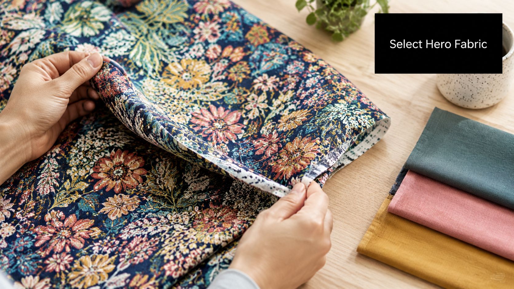
When I'm matching coordinates to a print, I don't pull the loudest colour first. I usually pull one of the quieter colours hiding inside it. The tiny leaf green, the muted background blue, the soft tan between the flowers. Those often make the most useful companions.
Swatches are not optional
If you're shopping online, get swatches. That sounds basic, but it's the step people skip because they want to get on with sewing. Screen colour lies in all sorts of innocent ways. Brightness settings shift things. Product photography changes from one website to another. A fabric can look cool one minute and warm the next depending on your device.
A helpful comparison tool outside sewing is this stylist guide to extension colors, because it shows the same core truth. Fine distinctions in tone matter, and close-enough shades often aren't close enough once placed side by side.
Here's the swatch routine that works:
- Order the front-runner and at least a few alternatives. Don't back yourself into one choice.
- Label each swatch at once. Fabrics are much harder to identify later than you think.
- Pin or clip them together. Loose swatches scatter visual attention.
- Look at them with the pattern envelope or garment plan nearby. Context changes decisions.
Test under the light you actually live in
Fabric can behave beautifully by a window and terribly under evening bulbs. That's why I always test in several spots.
- Daylight by a window shows the clearest version of most colours.
- Grey daylight is useful because it exposes combinations that only work when the sun is flattering them.
- Indoor evening light matters if that's when you'll mostly wear the garment.
A sateen can bounce light back and look brighter than a matte cotton in the same apparent shade. A washed linen can look softer and chalkier than expected. Surface changes colour perception as much as dye does.
After you've checked still swatches, it helps to see another maker talk through selection in motion:
Check the fabrics at garment scale
This is the step that stops a lot of expensive mistakes. A tiny swatch can seem perfect, but once the fabric becomes a whole sleeve or skirt front, its effect changes. Before buying full meterage, I like to bunch the swatches, fold them, and overlap them roughly as the finished garment would sit.
Workshop note: If two fabrics only work when held flat and carefully separated, they probably won't work once sewn into a moving garment.
That's especially true with collars, cuffs, waistbands, facings, and contrast panels. Those areas sit close together, and any mismatch becomes much more obvious.
Pairing Patterns and Textures Like a Pro
The easiest way to make mixed fabrics look polished is to stop asking them to do the same job. When two prints both want all the attention, or when two strong textures both dominate, the outfit starts to feel noisy rather than intentional.
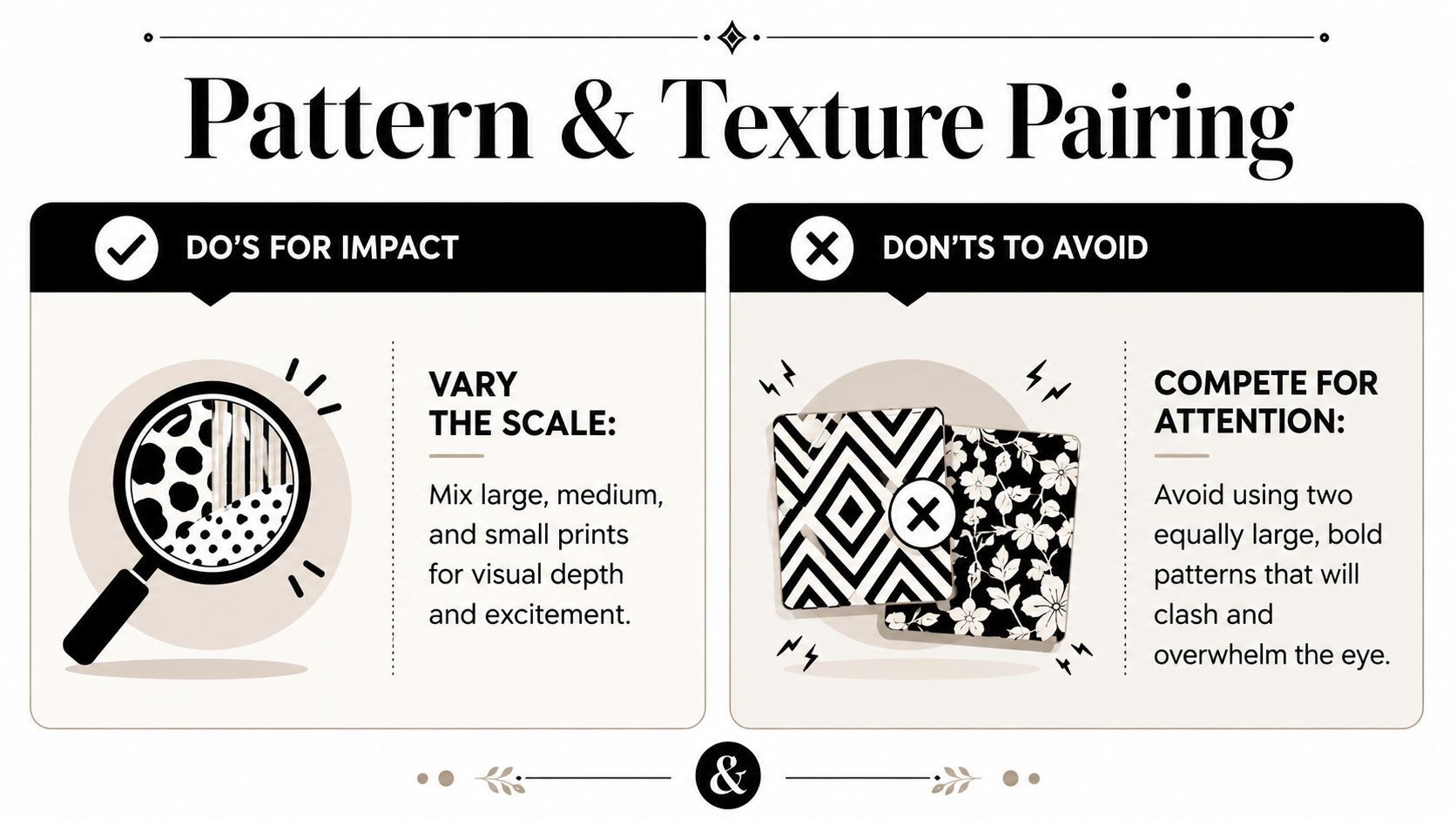
Pattern scale decides who leads
A large floral and another large floral usually quarrel. They may share colours, but if they have the same visual volume, the eye doesn't know where to settle. What works much better is a clear hierarchy.
A blouse in a sweeping floral cotton lawn can take a tiny geometric for the inner collar stand, cuffs, or pocket lining. A striped seersucker skirt can sit happily with a small scattered print top if one of the colours overlaps and the stripe is allowed to remain the stronger statement.
The trick I come back to is this:
- Choose one dominant print that everyone notices first.
- Add one quieter print with a smaller motif or lower contrast.
- Borrow a lesser colour from the main print rather than the most obvious one.
That last part matters. If your main print has coral flowers, sage leaves, and a cream ground, the sage or cream often makes a smarter coordinating choice than another loud coral.
Texture changes colour, not just feel
Sewists often think about texture only as a tactile issue. It isn't. Texture changes how colour reads. A smooth silk noil, brushed flannel, rib knit, washed denim, and crisp poplin all reflect light differently. That means the same broad shade can look richer, duller, softer, or sharper.
I've seen this play out with very simple combinations. A silk camisole in a muted champagne tone can look excellent under a rougher flax linen jacket because the difference in surface gives both fabrics room. A fine jersey in dark green can look more substantial under an olive wool cardigan because the knit texture deepens the whole pairing.
Don't aim for uniformity. Aim for conversation between fabrics.
A few combinations that usually behave well
Smooth with rustic
Viscose challis with linen, silk with wool, cotton sateen with washed denim.Soft with structured
Jersey under twill, brushed cotton with crisp poplin details, double gauze with needlecord.Subtle print with tactile solid
Ditsy print with corduroy, pinstripe with boiled wool, small check with denim.
What doesn't usually work is combining too many attention-grabbing features at once. If the colour contrast is high, keep the print quieter. If the texture is dramatic, let the palette calm down. Balance is what makes mixed fabrics look expensive.
Common Colour Matching Pitfalls and Quick Fixes
Even careful sewists get caught out. Most colour problems aren't disasters. They're usually one wrong relationship inside an otherwise sound project. Once you identify the problem properly, the fix is often simple.
Where matching goes wrong
The most common issue is an undertone mismatch. Two blues may both be attractive, but if one leans inky and cool while the other is softened with a green cast, they can make each other look dirty. This often shows up after sewing because seam placement brings the fabrics into direct contact.
The second problem is a flat-looking project. That usually comes from matching similar values too closely. If every fabric is mid-tone, the garment can look worthy but forgettable.
Then there's print competition. A medium floral with a medium check and a medium stripe can create a low-level visual argument. Nothing wins, so everything feels unsettled.
Quick Fixes for Colour Matching Woes
| Problem | Likely Cause | Solution |
|---|---|---|
| Colours looked right before sewing but feel wrong together now | Undertones clash once fabrics touch directly | Add a buffer such as cream, charcoal, denim, or another neutral through binding, piping, a placket, or a waistband |
| The garment looks flat | Values are too similar | Introduce a noticeably lighter or darker element with buttons, topstitching, a belt, collar, cuffs, or layering piece |
| Prints feel chaotic | Pattern scales are competing | Remove one print if possible, or reduce its role to facings, pocket bags, or other small areas |
| One fabric seems louder than expected | Surface sheen is amplifying the colour | Pair it with matte companions and keep shiny fabric away from large contrast panels |
| Neutrals still don't sit well together | The “neutral” temperatures differ | Replace one neutral with a warmer or cooler version rather than forcing a near-match |
The buffer trick saves more projects than you'd think
If I had to name one rescue technique, it's adding a third fabric as a separator. Bias binding, neckbands, pocket welts, waist facings, and piping are all useful places to do this. A neutral can stop two almost-right colours from rubbing against each other visually.
This is also where accessories earn their keep. If a sewn outfit feels slightly dull, a darker belt, scarf, or cardigan can restore contrast without unpicking a thing. Not every fix has to happen inside the seam allowance.
Inspiration Gallery Garment Project Examples
The nicest way to understand fabric colour matching is to picture it in finished clothes. Once you start thinking in outfits and garment details rather than isolated swatches, your choices become clearer.
A tiered summer skirt with a gentle shift
A tiered maxi skirt is perfect for an analogous palette. Think pale peach at the top tier, soft coral in the middle, and muted rust at the hem, all in lightweight cotton lawn or another airy woven. Because the colours sit near one another, the skirt reads as coordinated rather than stripy.
The key is keeping the fabrics similar in weight and softness. If one tier is crisp and another is drapey, the colour story won't rescue the imbalance in hang.
A striped shirt dress with one pulled solid
A classic shirt dress in navy-and-white striped cotton already gives you a built-in palette. Instead of adding a random contrast, pull the navy into a solid collar, cuffs, or button placket. It looks tidy, considered, and much more expensive than using a second statement fabric for the sake of it.

That kind of project also shows why hidden colours inside a print or stripe are so useful. You don't need to invent a palette from scratch when the fabric has already done part of the work for you.
A floral jersey top with a cardigan that belongs with it
For everyday wear, one of my favourite combinations is a floral jersey top on a dark green ground with a cardigan in olive or moss. The cardigan colour comes from the leaves or stems in the print, not the flowers. That's why it feels connected without looking overly matched.
This is often the difference between a handmade wardrobe looking cohesive and looking accidental. Pull supporting colours from the quieter parts of the print, and your garments start to relate to one another naturally.
If you're ready to put these ideas into practice, More Sewing is a useful place to start for dressmaking fabrics, swatches, and project supplies. A well-chosen sample, a good basic solid, and the right notions make colour decisions much easier before you ever cut into the good fabric.